

Overriding & Extending Global styles in Chakra UI
Modifying default global styles in ChakraUI

What is Chakra UI
Chakra UI is an open-source library of pre-built user interface components that simplifies web development for developers by allowing them to create functional websites quickly and easily without writing custom CSS or HTML code. These components, such as buttons, forms, and modals, are customizable and follow accessibility, usability, and responsive design best practices, making them user-friendly and accessible.
Chakra UI works well with popular front-end frameworks such as React and Next.js, but it can also be integrated with other tools and libraries. Although it provides several React-specific features, it is still built on top of CSS and HTML, allowing its CSS styles and components to be used with non-React web frameworks.
However, some of Chakra UI's features may not work optimally with non-React web frameworks. For example, its responsive design system relies on React's useState hook to detect screen size, so it may not work as expected without React. Additionally, Chakra UI's theming system relies on emotion, a CSS-in-JS library, so it may not work as expected.
Benefits of Chakra UI
Theming system: With ChakraUI, you can easily customize the look and feel of your application. This means you can quickly and easily change the colour scheme, typography, and other design elements of your site to suit your style guide without having to rewrite any code.
Accessibility: Chakra UI is designed with accessibility in mind, and it provides several accessibility features out of the box. For example, all components have proper aria attributes, the keyboard navigation is supported, and the colour contrast ratios comply with WCAG 2.1 guidelines. This ensures that websites built using Chakra UI are user-friendly and accessible to everyone.
Use of best practices: Chakra UI is designed to follow best practices in accessibility, usability, and responsive design.
Performance: Best practices integrated into this library ensure your application runs quickly and efficiently. Chakra UI uses a modern and lightweight design system based on styled-components. This allows the library to avoid heavy dependencies and ensures the CSS code is optimized for performance.
Extensive features: Lazy loading and code splitting are part of the unique features ChakraUI gives developers access to. These features help to reduce the amount of code that needs to be loaded and executed by the browser, which can significantly improve page load times.
Global Styles in ChakraUI
Since ChakraUI is built with a theming system, default styling exists for all components and elements in the library. This can help ensure consistency in the appearance and behaviour of your UI components.
This tutorial will guide you through the process of modifying the default ChakraUI styling of any React application utilising this library by extending or overriding the global styles provided.
How to modify Global Styles in Chakra UI
The Project
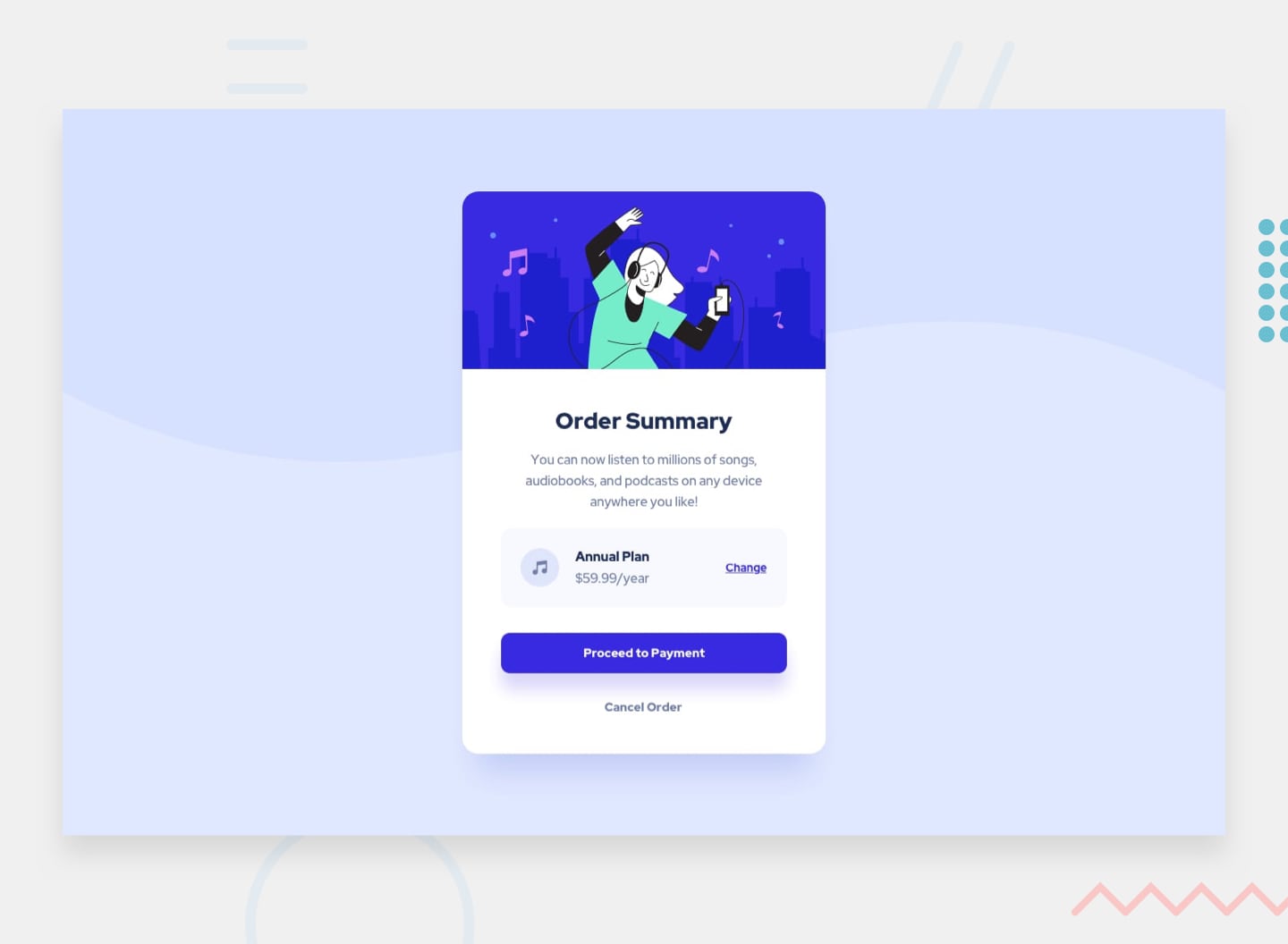
To demonstrate how to modify ChakraUI, I'll be building a simple one-page website containing an Order summary component as shown in the image below.
Setting up ChakraUI
In React.js, there are two ways to install ChakraUI:
a. In a new folder:
- Simply run the following command in terminal
npx create-react-app <APPNAME> --template @chakra-ui
b. Or, in a newly installed create-react-app:
Install react app
  npx create-react-app <APPNAME>
  cd <APPNAME>
Inside the project directory, run the following in the terminal
npm i @chakra-ui/react @emotion/react @emotion/styled framer-motionSetup Provider: You need to set up the
ChakraProviderat the root of your application. This should be in yourindex.jsfile//index.js file import React from "react"; import ReactDOM from "react-dom/client"; import "./index.css"; // 1. import `ChakraProvider` component import { ChakraProvider } from "@chakra-ui/react"; import App from "./App"; // 2. Wrap ChakraProvider at the root of your app const root = ReactDOM.createRoot(document.getElementById("root")); root.render( <React.StrictMode> <ChakraProvider> <App /> </ChakraProvider> </React.StrictMode> );
Using ChakraUI's default styling
I setup the project and developed it using CharaUI's default styling and this is what the frontend code looks like https://github.com/maryojo/order-summary-chakra-tutorial/blob/d0a00421de81a43760e93c0ba547d033c1adf658/src/App.js
Result: https://644b7458337d8467791f868c--lambent-llama-1b74cc.netlify.app/
Modifying global styles in ChakraUI
Theming in Chakra UI follows the Styled System Theme Specification approach, where a theme object defines the application’s colour palette, font, breakpoints, spacing, and more.
To modify the existing codebase to suit the application's theme, we'll be overriding the default font family and colours of some components
Create a file named
Theme.jsin thesrcfolderImport
extendThememodule inTheme.jsfile//Theme.js file //1. Import extendTheme import { extendTheme } from "@chakra-ui/react";Create a
themeobject which would contain the formatted styles as shown below://Theme.js file //1. Import extendTheme import { extendTheme } from "@chakra-ui/react"; //2. Theme object containing custom styling const themes = { styles: { global: { 'html, body': { backgroundColor: 'hsl(225, 100%, 94%)', fontFamily: `'Red Hat Display', sans-serif`, }, a: { color: 'hsl(245, 75%, 52%)', }, h1: { color: 'hsl(245, 75%, 52%)', fontSize: '64px', lineHeight: '80px', }, }, }, }Export theme
//Theme.js file //1. Import extendTheme import { extendTheme } from "@chakra-ui/react"; //2. Theme object containing custom styling const themes = { styles: { global: { 'html, body': { backgroundColor: 'hsl(225, 100%, 94%)', fontFamily: `'Red Hat Display', sans-serif`, }, a: { color: 'hsl(245, 75%, 52%)', }, h1: { color: 'hsl(245, 75%, 52%)', fontSize: '64px', lineHeight: '80px', }, }, }, } //3. Export theme const theme = extendTheme(themes); export default theme;Call the theme as a prop in ChakraProvider in the index.js file
   //index.js file
   import React from "react";
   import ReactDOM from "react-dom/client";
   import "./index.css";
import theme from Theme;
// 1. import ChakraProvider component import { ChakraProvider } from "@chakra-ui/react"; import App from "./App";
// 2. Wrap ChakraProvider at the root of your app const root = ReactDOM.createRoot(document.getElementById("root")); root.render( <React.StrictMode> </React.StrictMode> ); ```
Final result
Any more custom styling could be added to the Theme.js file in the format shown. ChakraUI's styling could also be used to create custom styles for components.
Code: https://github.com/maryojo/order-summary-chakra-tutorial
Live site: https://lambent-llama-1b74cc.netlify.app/
Further steps
Read more about ChakraUI's global styles from the documentation


