Development Limitations That UI Designers Should Know About
Did the Developers Stick to the Design?
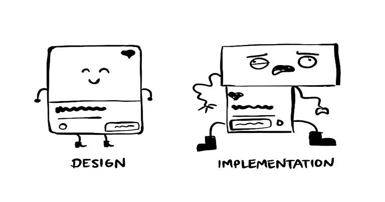
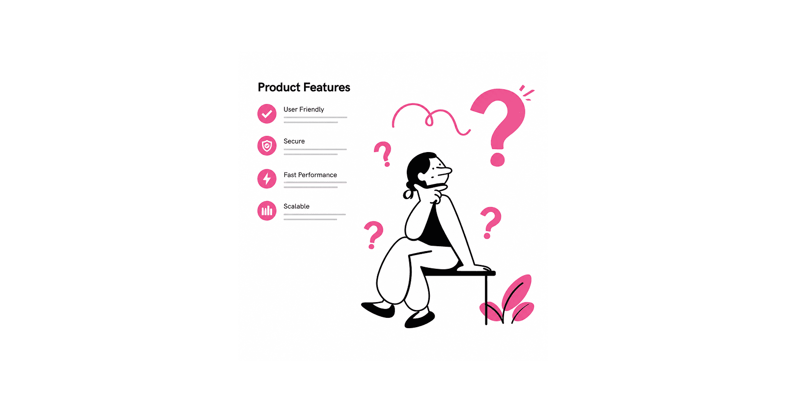
Reality Check
You've wrapped up your design, and it looks amazing, sleek, clean, and exactly how you envisioned it. You’re excited to see it come to life and watch users interact with your thoughtfully crafted interface and the features. But then, launch day comes, and you're left wondering: is this even the same design I worked on, or did the developers decide to remix it?
This article sheds light on common challenges that arise during development and what designers need to know about them. Understanding these aspects will help you create UI designs that are practical to implement, reducing the risk of disappointment.
As a Frontend Engineer with experience in both UI/UX design and development, I’ve encountered this issue firsthand and understand why it happens sometimes. In this article, I’ll explain the reasons behind these implementation gaps and share tips to help designers navigate this process more effectively.
Introduction
The interaction between design and development has changed a lot in modern web applications. Designers can’t just work on their own anymore; technical limitations and opportunities need to be considered from the very start. This does not mean limiting creativity, but about making smarter decisions that lead to better user experiences, while giving room for technical considerations.
When designers get a handle on things like component structure and how performance and security affects the design, they can be creative while still making sure it’s doable. It also helps designers and developers work together better, shifting the conversation from "Can we even do this?" to "What’s the best way to make this happen?"
The following highlghts are key technical factors UI designers should know about to create digital experiences that are not just creative and usable but also practical and functional.
Cross-Browser/Platform Compatibility & Rendering Differences
Advanced CSS Styling Differences: Some advanced CSS features can behave differently depending on the browser that is being used. This applies to some CSS grid features and how it is handled or if it’s even recognized in some older browsers. This would affect a design trend like bento grid which relies heavily on CSS grids.
Form Elements: Native form elements (like the checkboxes, radio buttons, dropdowns, checkboxes, sliders, etc) can look and work differently between browsers and operating systems. Custom styling helps to keep things consistent but sometimes, overriding default styling is harder or easier also based on the browser type.
Fonts and Typography: Depending on the browser, fonts can look a bit different because of how some font properties are handled. Also custom fonts can look a bit off or act unpredictably across different devices and browsers. An example is when the font "Roboto" is used with a specified font-weight of
300for headings, this is what happens on different browsers:Chrome (Windows): The font renders as expected, light and clean due to Chrome's font rendering and anti-aliasing settings.
Firefox (Windows): The font appears slightly bolder compared to Chrome, as Firefox uses different anti-aliasing methods that emphasize clarity over weight precision.
Safari (Mac): The font looks sharper but slightly thinner because Safari tends to favor macOS’s native font smoothing.
Color Display and Manangement: Colors might appear a bit different because there’s no universal color management across all browsers. Colors sometimes vary based on the device’s color profile. e.g an AMOLED display on Android might make the color appear more saturated than an LCD display on an older iPhone.
Performance Issues
Animations: Complex animations or those with high frame rates might cause lag on older browsers or devices with lower power.
Heavy Graphics: Large images, SVGs, or videos can slow down load times and might even cause the browser to crash. Always keep performance in mind.
Challenges with Responsiveness
Breakpoints: Complex design makes development more complicated escpecially when considering that it has to fit across a lot of different breakpoints (like different tablets and small phones).
Scaling Issues: Designs that are created to look perfect at a specific size (a fixed size inside Figma) might not adapt well to other screen sizes or resolutions. For example, elements could appear too small on a larger screen or too cramped on a smaller one if responsiveness isn’t considered during the design process.
Images: In designing for responsiveness, one image might not be adequate for all screen sizes.
Scalability and Maintenance
Over-customization: Highly unique or custom designs can be tough to maintain or update over time.
Reusable Components: Designs that don’t follow consistent patterns might not fit well into the already existing reusable component strategy usually done by developers. This is why it's important to work with a component library or design system
State Management Complexity
Dynamic States: Designs that include complex UI states like multi-step forms or dynamic filters can be challenging to implement without causing bugs or slowdowns.
Error Handling: Things like error states, validation, and loading indicators sometimes get overlooked in designs, but they’re key to providing an overall smooth experience for users.
Backend and API Constraints
Data Availability: If your design depends on specific data, like real-time updates or detailed analytics, it’s important to know whether the backend can support those needs.
Performance Implications: Features like infinite scrolling or heavy data visualizations can put a lot of pressure on APIs and databases, which might affect performance.
Security Implications: Features like infinite scrolling or heavy data visualizations can put a lot of pressure on APIs and databases, which might affect performance.
Content and Localization
Text Lengths: When designing for multilingual sites, remember that translations can sometimes be longer than the original text. If this isn’t planned for, it can break the interface layout.
Dynamic Content: Placeholder/fixed text (usually done in Figma) is often much shorter than real content. If you don’t design with actual content in mind (for both short and long text), it might end up in unexpected layout issues like text overflow.
Tips for Practical UI Designs
The following tips help in ensuring that your designs translate well into code while maintaining functionality and performance:
Design with modularity in mind: Think in reusable components. Instead of designing every button, card, or input from scratch, create a library of consistent, modular elements. This makes it easier for developers to replicate your designs across different pages or features. It also makes it easy for design to create interfaces. This is called a component library and a more detailed approach would be creating a design system which is made up of the design styles, component library, pattern library and interface elements.
Provide Layout Fallbacks: Not every browser or device will support complex layouts perfectly. Design alternative versions that adapt gracefully to technical constraints. An example is if a CSS Grid-based layout fails in implementation, ensure a flexbox or block-based fallback still delivers a readable and functional experience.
Provide Font Fallbacks: Custom fonts might not always load or render as expected. Provide or specify alternative system fonts to ensure your typography remains visually appealing and legible. On the frontend this is usually handled like by specifying in CSS like this - "Roboto", "Helvetica Neue", Arial, sans-serif.
Optimize Assets: Provide developers with optimized images, SVGs, and font files to improve performance and loading speed. Offer different image sizes (e.g., 1x, 2x, 3x) for responsive designs, and ensure SVGs are cleaned to remove unnecessary metadata (e.g an unwanted background or really small overlooked part).
Account for Edge Cases that go beyond the “ideal” scenario. Think about how your design will handle edge cases like extremely long user names or input values, empty states where no data is available, unexpected user behaviors, such as clicking buttons multiple times.
Design Loading and Error States: Include visuals for loading indicators, error messages, and empty states. These are sometimes overlooked but are critical for a seamless user experience.
Provide a Prototype: Interactive prototypes help developers understand your vision beyond static screens. Prototypes help to demonstrate how transitions, animations, and interactions should work. It also helps you as a designer to connect the flow step-by-step, which could help identify implementation issues and missing steps of the user flows.
Provide Animation Fallbacks: Animations can elevate user experience, but not all devices or browsers handle them well. Provide fallback designs for scenarios where animations can’t run smoothly.
Preview Designs Across Devices: Test your designs on various devices to identify potential issues early. This ensures your designs look and function as intended everywhere. This could be done by using the Figma's Preview and Figma Mirror after designing.
Design for Breakpoints Responsive design is essential. Define how your layout adapts across screen sizes by creating breakpoints for mobile, tablet, and desktop views. Test that the design works for the defined breakpoints. For example a breakpoint of
By following these practices, you’ll make your designs more practical for development, reduce back-and-forth, and create a better experience for both users and developers.
To developers, mention other limitations you would like designers to know about in the comments!
Credits
Cover image from https://uxdworld.com/20-famous-design-memes-to-make-you-laugh/